Winsorization: Handling Outliers in Machine Learning
In data analysis and machine learning, outliers can significantly skew results, leading to poor model performance and misleading inferences. Whether we’re developing supervised models like regression, unsupervised models like clustering, or simply trying to understand the central tendency of our dataset, the impact of outliers can be profound.
While removing outliers entirely is one option, it may not be ideal in many scenarios. Here’s where Winsorization comes in: a simple yet powerful statistical technique to mitigate this issue.
In this article, we’ll explore:
- What Winsorization is and how it works
- Why Winsorization is useful in data analysis and machine learning
- Different Winsorization methods and when to use them
- How to apply Winsorization using Python, with practical examples
Advance your data science and machine learning skills with our comprehensive expert led courses.

What is Winsorization?
Winsorization (named after biostatistician Charles P. Winsor), or capping, involves replacing extreme values in a dataset with less extreme values. Unlike trimming, which completely removes outliers, winsorization caps them at specified thresholds, thereby retaining all data points while reducing their impact on statistical measures.
The process typically follows these steps:
- Identify a threshold value beyond which values are considered outliers
- Replace values exceeding this threshold with the threshold value itself
For example, in a 95% winsorization, values below the 5th percentile are replaced with the 5th percentile value, and values above the 95th percentile are replaced with the 95th percentile value.
Why Use Winsorization?
Winsorization offers several advantages in data analysis and machine learning:
- Preserves sample size: Unlike trimming, winsorization maintains the original number of observations, which is particularly important with smaller datasets or when we don’t want to exclude any observations.
- Reduces the impact of outliers: It limits the influence of extreme values on statistical metrics like the mean and standard deviation.
- Improves model robustness: Machine learning algorithms like regression often perform better on winsorized data, as outliers can disproportionately affect model training.
Winsorization Methods
In its original conception, Winsorization involves capping data at percentile values. In machine learning, we also use different methods to find those capping limits, and very often, we also call it Winsorization, though strictly speaking, it is not.
In fact, Feature-engine‘s Winsorizer class offers four primary methods for determining these cut-off points:
1. Gaussian Method
The Gaussian method identifies outliers based on the standard deviation from the mean, using the normal distribution as a reference.
- Right tail: Values above mean + 3 × standard deviation
- Left tail: Values below mean – 3 × standard deviation
This method works well for data that follows a normal distribution but may not be optimal for skewed or multi-modal data. The default 3-standard deviation boundary is based on the principle that 99.7% of values fall within three standard deviations of the mean in a normal distribution.
2. IQR Method (Interquartile Range)
The IQR method uses the interquartile range to identify outliers, which makes it more robust to deviations from normality.
- Right tail: Values above 75th percentile + 1.5 × IQR
- Left tail: Values below 25th percentile – 1.5 × IQR
Where IQR is the difference between the 75th and 25th percentiles. This approach is widely used in box plots and is excellent for detecting outliers in skewed distributions.
While the standard multiplier is 1.5 for moderate outliers, 3 is also commonly used for extreme outliers.
3. MAD Method (Median Absolute Deviation)
The MAD method uses the median absolute deviation from the median and is robust against extreme outliers.
- Right tail: Values above median + 3.29 × MAD
- Left tail: Values below median – 3.29 × MAD
Where MAD is the median of the absolute deviations from the median, the factor 3.29 is approximately equivalent to 3 standard deviations in a normal distribution. This method is handy for data with extreme outliers or heavy-tailed distributions.
4. Percentile Method (i.e., Winsorization)
The quantile or percentile method directly uses percentiles as cut-off points.
- Right tail: Values above the 95th percentile
- Left tail: Values below the 5th percentile
This is the most straightforward approach and doesn’t make assumptions about the underlying distribution. It simply caps a fixed percentage of data points on each end of the distribution.
When using Feature-engine’s Winsorizer, you can control the capping criteria with the fold parameter. For instance, for the Gaussian method, the fold value multiplies the standard deviation; for IQR, it multiplies the interquartile range; for MAD, it multiplies the median absolute deviation; and for quantiles, it determines the percentile threshold.
Master Winsorization and other outlier capping and trimming methods with our course Feature Engineering for Machine Learning.
Applying Winsorization with Python
We can apply winsorization using various libraries like pandas, scipy, and Feature-engine. I recommend sticking with Winsorizer from Feature-engine because it provides easy-to-use implementation for multiple methods and seamless integration with scikit-learn pipelines.
That said, I’ll start by showing how to apply Winsorization using Pandas and Scipy.
Toy dataset
First, let’s create a simple dataset with 1000 rows and two variables, where:
var1: has outliers (right-skewed)var2: does not have substantial outliers.
Here’s the piece of code to generate such data:
import numpy as np
import pandas as pd

# Set seed for reproducibility
np.random.seed(42)

# Create a variable with outliers
normal_data = np.random.normal(loc=10, scale=2, size=970)
lower_outliers = np.random.uniform(low=0, high=10, size=5)
upper_outliers = np.random.uniform(low=20, high=30, size=25)
combined_data = np.concatenate([normal_data, lower_outliers, upper_outliers])

# Create dataframe with simulated data
df = pd.DataFrame({
    "var1": combined_data,
    "var2": np.random.normal(loc=10, scale=2, size=1000)
})
We can then display the basic descriptive statistics for both variables:
# Display basic statistics
df.describe(percentiles=[.1, .25, .5, .75, .95])
As a result, it will display these stats:
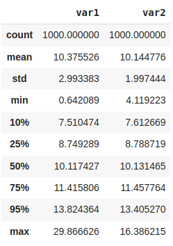
Notice the difference between the minimum values vs the 10th percentile, then the maximum values vs the 95th percentile. Where do you spot the difference between var1 and var2? Tip: the higher difference on var1 is due to the outlier 😉
Advance your data science and machine learning skills with our comprehensive expert led courses.
Comparing Winsorization with trimming
For didactic purposes, let’s focus only on the quantile method for capping var1. Likewise, I’ll use only pandas in this section.
We can compute the cut-off values and apply capping using pandas directly:
lower_limit, upper_limit = df.var1.quantile([0.05,0.95]) # or np.quantile(df.var1, [0.05,0.95])
var1_winsorized_values = df["var1"].clip(lower=lower_limit, upper=upper_limit)
Alternatively, we could use the ẁinsorize function from scipy.stats.mstats :
from scipy.stats.mstats import winsorize

var1_winsorized_values = winsorize(df["var1"].copy(), limits=(0.05,0.05))
What about trimming? How does the winsorization compare to trimming (i.e., simply removing the outliers)?
To test that, let’s create a function to detect outliers using percentiles and then use it to remove those observations from var1:
# Creating the function to detect outliers
def detect_outliers(data, limits=(0.05, 0.95)):
    """Detect outliers in data based on quantile limits."""
    data = np.asarray(data)

    # Calculate the quantile values
    lower_quantile, upper_quantile = np.quantile(data, limits)

    # Create boolean mask for outliers
    outlier_mask = (data < lower_quantile) | (data > upper_quantile)

    return outlier_mask

# Applying the function
outlier_mask = detect_outliers(df["var1"])
var1_trimmed_values = df.loc[~outlier_mask, "var1"]
For comparison, let’s also capture the original data for variable 1:
var1_raw_values = df["var1"]
So far, we’ve created the following variables:
var1_raw_valueswith the original valuesvar1_winsorized_valueswith the winsorized valuesvar1_trimmed_valueswith the trimmed values
Let’s compare them with a simple data visualization. First, let’s import the data visualization libraries and set a custom optional styling for our plots:
import matplotlib.pyplot as plt
import seaborn as sns

# See all possibilities at https://matplotlib.org/stable/users/explain/customizing.html
sns.set_theme(
    context="talk", style="ticks",font_scale=.7,
    rc={
      "figure.figsize": (8,4),
      "font.weight": "regular", "axes.labelpad": 10, "axes.titlepad": 20,
      "axes.titleweight": "bold", "axes.grid":True, "grid.alpha":.2
    }
)
Then, we create out figure:
# Combining data for plotting
data = [
    var1_raw_values,
    var1_winsorized_values,
    var1_trimmed_values
]
# Plot labels on x axis
labels = ["Original data", "Winsorized data", "Trimmed data"]

# Bxplot
plt.boxplot(data, tick_labels=labels)
# Figure title
plt.title("Comparison of Original Winsorized, and Trimmed Data Distributions", size=14)

# Figure custom axes adjustment
sns.despine(trim=True, offset=10)

plt.show()
In the following figure, we no longer see outliers on both winsorized and trimmed approaches:
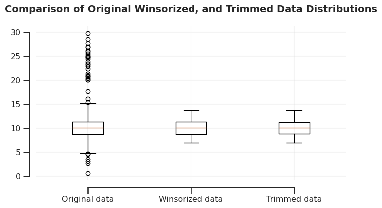
What do you think happened to the outliers?
In the winsorization approach, the lower limit cut-off replaced the lowest values, while the upper limit cut-off replaced the largest values. The trimming approach removed them, therefore reducing the number of observations.
We can compute the resulting sizes for each array:
{label: len(values) for label,values in zip(labels,data)}
We can see that the trimmed model has 100 fewer observations compared to the total number of observations:
{'Original data': 1000, 'Winsorized data': 1000, 'Trimmed data': 900}
We can also compare averages for every data (original, winsorized, and trimmed) using a simple arithmetic mean:
{label: f"{values.mean():.2f}" for label,values in zip(labels,data)}
We can see that the winsorized mean is smaller than the observed mean:
{'Original data': '10.38', 'Winsorized data': '10.15', 'Trimmed data': '10.12'}
This happens because the influence of outliers is mitigated on both the winsorized and trimmed mean. While both mitigated the outliers, only the winsorized version kept all the observations.
Keep in mind that the resulting averages can be lower or higher depending on the original data distribution (left- or right-skewed).
The observed differences in original vs winsorized data might be MUCH HIGHER in real-world data due to the impact of extreme values. Remember that this is a simple simulated data for didactic purposes.

Comparing “winsorization” methods
In this section, I’ll compare the different ways of capping that we normally use in machine learning. I use “winsorization” in inverted commas, because winsorization itself means capping with percentiles, but in machine learning, it is sometimes used to refer to all types of capping.
Let’s check how Feature-Engine’s Winsorizer class can quickly compute and apply the distinct methods to handle outliers.
First, let’s import the class:
from feature_engine.outliers import Winsorizer
In the following code snippet, we’ll instantiate Winsorizer classes for all available capping methods: Gaussian, IQR, MAD, and quantiles.
gaussian_winsorizer = Winsorizer(capping_method="gaussian", tail="both")
iqr_winsorizer = Winsorizer(capping_method="iqr", tail="both")
mad_winsorizer = Winsorizer(capping_method="mad", tail="both")
quantiles_winsorizer = Winsorizer(capping_method="quantiles", tail="both")
By using tail=”both” , we’ll make the transformer compute both lower and upper limits. We have also used the default cut-off values according to the specified method. You can check the default strategy and further details here.
Feature-Engine’s Winsorizer leverages scikit-learn methods like .fit, .transform, and .fit_transform. Let’s now apply the winsorization and store the results for each method:
winsorizer_results = {
    "Gaussian": gaussian_winsorizer.fit_transform(df)["var1"],
    "IQR": iqr_winsorizer.fit_transform(df)["var1"],
    "MAD": mad_winsorizer.fit_transform(df)["var1"],
    "Quantile": quantiles_winsorizer.fit_transform(df)["var1"]
}
Just like scikit-learn, we can inspect learned attributes after applying .fit. For instance, let’s check the learned lower and upper limits for the Gaussian method:
print("Lower limits:", gaussian_winsorizer.left_tail_caps_)  # lower limit
print("Upper limits:", gaussian_winsorizer.right_tail_caps_) # upper limit
The output shows the limits for both variables:
Lower limits: {'var1': 1.3998681078227282, 'var2': 4.155441503791718}
Upper limits: {'var1': 19.351183621206175, 'var2': 16.134111365006017}
Finally, we will plot the original and transformed distributions side by side to compare the original data with the different winsorization methods:
Heads up: The following plotting code is a bit long, so I recommend directly jumping to the output graph in case you’re not familiar with matplotlib and seaborn. Likewise, feel free to explore it since I’ve provided comments throughout.
# Create Figure
fig, axes = plt.subplots(
    nrows=2, ncols=5, figsize=(16, 4),
    sharex=False, sharey=False, gridspec_kw={"height_ratios": (.15, .85)}
)

# Handle histogram bins
bins = 30
binrange = df.var1.agg(["min","max"])

# Plot original data
sns.boxplot(x=df["var1"], boxprops={'alpha': 0.5}, ax=axes[0, 0])
sns.histplot(x=df['var1'], alpha=0.5, color='#19194E', bins=bins, binrange=binrange, kde=True, ax=axes[1, 0])
axes[0, 0].set_title("Original distribution", weight="bold") # set title
axes[0, 0].axis("off") # remove axis for boxplot

# Create proxy artists for the legend
from matplotlib.patches import Patch
legend_elements = [
    Patch(facecolor='#19194E', alpha=0.5, label='Original data'),
    Patch(facecolor='#F1750B', alpha=0.5, label='Winsorized data')
]

# Share y-axis among histograms manually
for i in range(5):
    axes[0, i].set_xlim(binrange)
    axes[1,i].set_xlabel("value")
    if i > 0:
        axes[1, i].sharey(axes[1, 0])  # Share y-axis with first histogram
        axes[1, i].tick_params(axis='y', labelleft=False)

for i, (winsorizer_method, winsorized_data) in enumerate(winsorizer_results.items(), start=1):

    # Boxplot with winsorized distribution
    sns.boxplot(
        x=winsorized_data, ax=axes[0, i], color="#F1750B"
    )
    # Histogram with original distribution
    sns.histplot(df['var1'], alpha=0.5, color='#19194E', bins=bins, binrange=binrange, kde=True, ax=axes[1, i])
    # Histogram with winsorized distribution
    sns.histplot(winsorized_data, alpha=0.5, color='#F1750B', bins=bins, binrange=binrange, kde=True, ax=axes[1, i])

    axes[1,i].set_ylabel(None) # remove ylabel as we already have it for the on the first axis
    axes[0, i].axis("off")     # remove axis for boxplot
    axes[0, i].set_title(winsorizer_method, weight="bold") # set title

# Figure main title
plt.suptitle("Winsorization Methods", x=0.5, y=.95, weight="bold", size="large")

# Add a single legend at the bottom center
fig.legend(
    handles=legend_elements, loc='lower center', bbox_to_anchor=(0.5, -0.1),
    ncol=2, frameon=False, fontsize=12
)

# Despine top-right axes
sns.despine(trim=True, offset=10)

# Adjust layout
plt.tight_layout(w_pad=2)
plt.subplots_adjust(hspace=0.1)

plt.show()
The output figure shows the distribution for each method + original values:
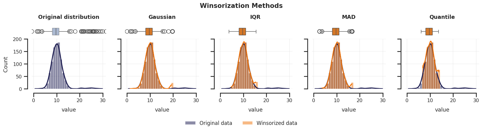
Note the outlier markers on all box-plots and the last bin height for the “winsorization” methods.
What conclusion can you draw from it?
We can also see the mean and median across these methods:
(
    df[["var1"]]                              # Take original distribution
    .join(pd.DataFrame(winsorizer_results))   # Join with winsorized distributions
    .agg(["mean","median"])                   # Compute the original and winsorized means
    .style.highlight_max(axis=1)              # Style dataframe to highlight maximum value per row
)
The output shows the same value for the median, while the mean is higher for the original values.
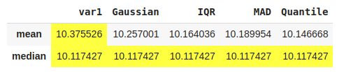
These visualizations and descriptive statistics effectively demonstrate how Winsorization successfully minimizes the impact of outliers on the central tendency of the data, while preserving all observations.
Integration with scikit-learn pipelines
Feature-engine transformers, including Winsorizer, integrate seamlessly with scikit-learn pipelines. I’ll demonstrate it using the Diabetes toy dataset from scikit-learn.
Let’s first import the required functions:
from sklearn.datasets import load_diabetes
from sklearn.linear_model import LinearRegression
from sklearn.model_selection import train_test_split
from sklearn.pipeline import Pipeline
from sklearn.preprocessing import PolynomialFeatures
Let’s now load and split the dataset into training and test sets:
# Load Diabetes dataset
X, y = load_diabetes(as_frame=True, return_X_y=True)
# Split following data set into train and test
X_train, X_test, y_train, y_test = train_test_split(X, y, random_state=42)
We will create a scikit-learn Pipeline composed of the Feature-engine’s Winsorizer, polynomial feature creation, and a simple linear regression model:
model_pipeline = Pipeline(steps=[
    ("winsorizer", Winsorizer(capping_method="iqr", tail="both")),
    ("poly_features", PolynomialFeatures(degree=2)),
    ("regressor", LinearRegression())
])
We can now fit the entire pipeline and evaluate its performance:
# Train pipeline (transformers and regressor)
model_pipeline.fit(X_train, y_train)

# Evaluate model with R2
model_pipeline.score(X_test, y_test)
The model returns the following score:
0.7312270556460471
Is this score better than training a model without winsorization and polynomial features? What about using only winsorization? Only polynomial features? Try it out!
💡 Tip: comment out the step lines on the pipeline and rerun the code to re-evaluate the scores.
Here are the expected results for this task:
- Pipeline without Winsorizer and poly features:
0.5910509795491354 - Pipeline only with Winsorizer:
0.6586094597960834 - Pipeline only with poly features:
0.6563005894282617 - Pipeline with Winsorizer and poly features (like before):
0.7312270556460471
As you can see, Winsorizer improved the model performance and successfully combined it into a pipeline with another transformer to enhance performance even more!
Note: I also tested using the default capping method (gaussian), and the result was
0.68, which is way higher than 0.59 (without transformations) but not as high as0.73when using IQR.
Benefits Recap
Before discussing potential limitations, let’s quickly recap why Winsorization is valuable in data analysis and machine learning:
- Preserves all observations in the dataset, unlike trimming.
- Reduces the impact of outliers on statistical metrics.
- Potential improvement to model robustness, particularly for algorithms sensitive to extreme values.
- Integrates seamlessly with machine learning pipelines using the
Winsorizerclass.
Potential Cautions When Using Winsorization
While Winsorization is valuable, some situations warrant caution:
- Loss of extreme but genuine signals: In fraud detection or anomaly identification, extreme values might be our actual targets of interest.
- Distribution changes: Heavy Winsorization can modify the natural shape of our data, potentially impacting statistical tests and model assumptions.
- Threshold sensitivity: Results can vary significantly based on our chosen threshold (e.g., 95% vs 99%), requiring careful consideration.
- Redundancy with robust algorithms: Some machine learning models, such as tree-based algorithms (e.g., random forests and gradient boosting), are naturally robust to outliers, making Winsorization unnecessary.
Final Considerations
Winsorization is a simple yet powerful technique for handling outliers without discarding valuable data. Capping extreme values instead of removing them helps maintain sample integrity while reducing the impact of outliers on statistical measures and machine learning models.
In machine learning, we often use multiple capping methods—Gaussian, IQR, MAD, and Quantile—each suited to different types of data distributions and analytical needs. Practical implementation in Python, especially using Feature-engine’s Winsorizer, is straightforward and integrates seamlessly with machine learning pipelines.
References
- Feature-engine documentation.
- TrainInData blog article: “How to Detect Outliers in Python: A Comprehensive Guide“.
- Galli, Soledad (2024). Python Feature Engineering Cookbook (3rd ed.). Packt Publishing. Also available on Amazon.
- Dixon, W. J. (1960). Simplified estimation from censored normal samples. Annals of Mathematical Statistics, 31(2), 385-391.
Further resources
Check out the Feature Engineering for Machine Learning course if you want to learn more about this and other techniques to handle outliers: