Precision-Recall Curves: A Complete Guide With Python Examples
When working with machine learning models, a key aspect of the job is evaluating how well the model performs. For classification problems, several tools help us do that, including the ROC curve, gain charts, lift charts, and the Precision-Recall curve.
In this article, we will discuss the Precision-Recall curve in depth. We will build one with Python, compare it directly to the ROC curve, and look at when each one actually deserves your attention.
Understanding Precision and Recall
Before moving on to the Precision-Recall curve, we need to understand what precision, recall, and the confusion matrix are. Let’s dive in.
Confusion Matrix
A confusion matrix is a tool used in machine learning to evaluate the performance of classification models. It compares predicted versus true values for each class in the dataset.
In binary classification, this means evaluating performance across two classes. In multiclass classification, it means evaluating performance across multiple categories.
For example, suppose we have a binary classifier built to predict whether a patient has diabetes or not. The dataset contains medical records where each patient is labeled as either having diabetes (1, the positive class) or not having diabetes (0, the negative class). A confusion matrix lets us assess how accurately the model identifies these classes.
To master classification metrics in the context of imbalanced data, check out our book Machine Learning with Imbalanced Data.
Components of a Confusion Matrix
A confusion matrix consists of the following values:
- True Positives (TP): Instances that were correctly predicted as the positive class.
- True Negatives (TN): Instances that were correctly predicted as the negative class.
- False Positives (FP): Instances that were predicted as positive, but actually belong to the negative class.
- False Negatives (FN): Instances that were predicted as negative, but actually belong to the positive class.
The table below shows how these four outcomes fit together for our diabetes example, with our decisions in the rows and the actual outcomes in the columns:
| Actual Diabetic | Actual Not Diabetic | |
|---|---|---|
| Predicted Diabetic | True Positive (TP) | False Positive (FP) |
| Predicted Not Diabetic | False Negative (FN) | True Negative (TN) |
The diagram below shows this same layout for a general binary classification problem, color coded. On the y-axis, we find the actual labels for the target. On the x-axis, we see the predicted labels.
The quadrants marked in green show the instances correctly predicted by the model, the True Positives and True Negatives. The quadrants marked in red show the instances incorrectly predicted by the model, the False Positives and False Negatives.
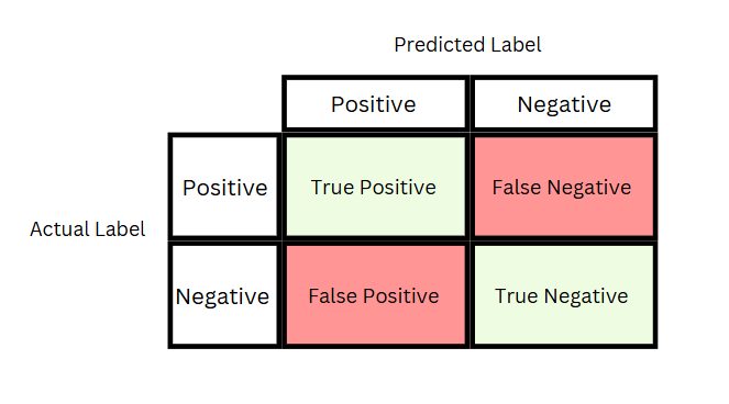
The first word of the terminology represents the truth, either true or false. The second word represents what the model predicted about the instance, that is, whether it belonged to the positive or negative class. So for “True Positive,” “Positive” indicates that the classifier predicted that the patient has diabetes, and “True” confirms that this prediction was correct.
For a deeper dive into the confusion matrix on its own, see our article on Confusion Matrix, Precision, and Recall.
Precision
Precision is the ratio between true positive predictions and the total number of positive predictions. In other words, precision represents the proportion of positive predictions that were actually correct.
Precision answers the question: “Of all the instances the model predicted as positive, how many were actually positive?” Precision is also known as the Positive Predictive Value.
A high precision value means that when the model predicts a patient has diabetes, it is usually correct.
Example: Imagine our binary classification model predicts 10 positive instances, patients it believes have diabetes. If 8 of these 10 patients actually have diabetes, the precision is high.
Precision is calculated as:
Precision = TP / (TP + FP)
So if 8 out of 10 positive predictions were correct, the precision score is:
Precision = 8/10 = 0.80, or 80%
Recall
Recall is the ratio of true positive predictions to the total number of actual positives. In other words, recall represents how well a classification model identifies all actual positive instances.
Recall answers the question: “Of all the actual positive instances, how many did the model correctly identify?” Recall is also known as the True Positive Rate (TPR), or sensitivity.
A high recall value means that the model successfully identifies most of the patients with diabetes.
Example: If there are 20 patients with diabetes in our dataset, and the model correctly identifies 15 of them, the recall is high.
Recall is calculated as:
Recall = TP / (TP + FN)
So if 15 out of 20 actual diabetics were correctly identified, the recall is:
Recall = 15/20 = 0.75, or 75%
We cover precision and recall in depth in our recent Machine Learning with Imbalanced Data.
Precision Recall Tradeoff: Striking the Right Balance
Precision and recall often trade off against each other. Improving one can come at the cost of reducing the other. This tradeoff matters most when we work with imbalanced datasets, such as our diabetes medical diagnosis example.
To capture this balance in a single number, we can use the F1 score.
F1 Score
The F1 score is the harmonic mean between precision and recall. It is calculated as:
F1 score = 2 x precision x recall / (precision + recall)
Using our diabetes example, with a precision of 0.80 and a recall of 0.75, we obtain:
F1 score = 2 x 0.80 x 0.75 / (0.80 + 0.75) = 1.2 / 1.55 = 0.77
Precision, recall, and the F1 score are all threshold dependent metrics. Let’s understand what a threshold value is, and how it affects each of them.
Classification Threshold Value
A threshold value is the probability cut-off point at which we decide whether to classify an instance as positive or negative.
In binary classification, the model outputs a probability score between 0 and 1 for each instance. The higher the score, the more likely the instance belongs to class 1.
We then need a threshold to decide whether an instance gets labeled as class 1. Let’s say, for now, the threshold value is 0.8.
If the probability score, say 0.9, is higher than the threshold of 0.8, the model classifies the instance as positive, diabetic.
If the probability score, say 0.7, is lower than the threshold of 0.8, the model classifies the instance as negative, non-diabetic.
By default, this threshold is usually set at 0.5, meaning a patient is classified as diabetic if the probability is greater than 0.5. A threshold of 0.5 is rarely optimal, particularly when working with imbalanced data, so we can, and often must, adjust it. That means moving the threshold up or down depending on whether we want to prioritize precision or recall.
How the Threshold Affects Classification
The threshold directly influences the balance between precision and recall.
A higher threshold makes the model more strict, requiring higher confidence before classifying an instance as positive. This typically improves precision, fewer false positives, but lowers recall, more false negatives.
A lower threshold makes the model less strict, classifying more instances as positive. This increases recall, fewer false negatives, but reduces precision, more false positives.
In most cases, increasing precision reduces recall, and vice versa. This happens because adjusting the threshold changes how strict the model is about classifying positives.
Optimizing the Right Metric
When dealing with diabetes prediction, the priority between precision and recall depends on the context, but in most cases, recall is more important.
Recall focuses on minimizing false negatives, cases where a diabetic patient is wrongly classified as non-diabetic. Missing a diagnosis can be very harmful, as it can lead to further complications. We want the model to identify as many actual diabetic cases as possible.
Precision, minimizing false positives, is important too. False positives might lead to unnecessary tests or treatments, but they carry less risk than a missed diagnosis.
Because of this, it is often crucial to find a threshold that maximizes recall while maintaining an acceptable level of precision. That is exactly the kind of tradeoff a Precision-Recall curve helps us visualize.
Note that for other datasets, the focus might be on precision rather than recall. This is something you need to discuss with the domain experts that will use your model. If neither one clearly wins for your problem, balanced accuracy is another useful metric to consider, since it weighs both classes equally.
What Is a Precision-Recall Curve?
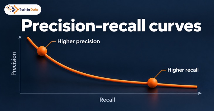
A Precision-Recall curve is a plot that allows us to see how precision and recall change across every possible classification threshold. It helps us find the threshold that best balances the two metrics for our specific problem.
Here is why a Precision-Recall curve is useful:
- Imbalanced Datasets: When one class is much more common than the other, metrics like accuracy become misleading. A Precision-Recall curve gives a clearer picture of how well the model detects the minority class.
- Trade-off Analysis: The curve visually represents the trade-off between precision and recall, letting us choose the balance that fits our use case.
- Model Comparison: The area under the Precision-Recall curve, known as average precision, lets us compare models directly. A higher value indicates better performance on the positive class.
Precision-Recall Curves vs. ROC Curves
The Precision-Recall curve is often introduced alongside another tool, the ROC curve. Both plot classifier performance across every threshold, but they measure different things, and confusing the two leads to real mistakes in practice.
What Is a ROC Curve?
A ROC curve, short for Receiver Operating Characteristic curve, plots the true positive rate against the false positive rate at every possible classification threshold. It answers a similar question to the Precision-Recall curve, from a different angle.
A model with no real skill produces the diagonal line running from the bottom left to the top right, giving an AUC of 0.5. A strong model bows toward the top left corner instead, catching true positives while keeping false positives low.
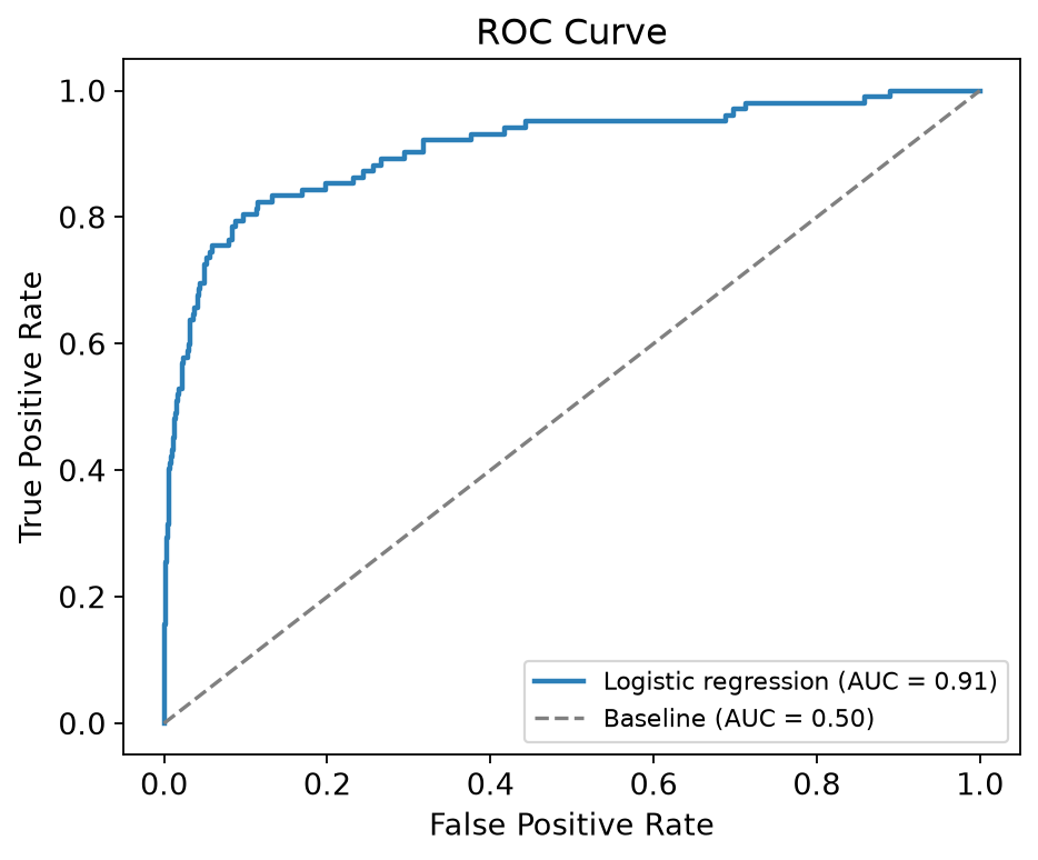
We will build this exact curve with Python further down. For now, let’s see how it actually compares to a Precision-Recall curve.
ROC Curve vs PR Curve: What Each One Actually Plots
A ROC curve plots the true positive rate, which is the same as recall, against the false positive rate, the complement of specificity. A Precision-Recall curve plots precision against recall instead.
The key difference comes down to how many confusion matrix quadrants each curve uses. A ROC curve is built from all four: true positives, true negatives, false positives, and false negatives. A Precision-Recall curve only uses three, true positives, false positives, and false negatives, and never looks at true negatives at all.
This single difference explains almost everything else. Because ROC depends on true negatives, and true negatives are usually the overwhelming majority class in an imbalanced dataset, a ROC curve stays fairly stable regardless of how rare the positive class is. A Precision-Recall curve, by contrast, is directly sensitive to that rarity, since precision’s denominator shrinks or grows with every positive prediction the model makes.
ROC Curve vs PR Curve: How the Baseline Differs
Every curve needs a baseline for comparison, that is, the performance of a random model.
For a ROC curve, the baseline is always the diagonal line from (0, 0) to (1, 1), giving an AUC of 0.5, regardless of class balance.
For a Precision-Recall curve, the baseline is a flat horizontal line, not a diagonal one. Its height equals the prevalence of the positive class in the data, in other words, the fraction of positive instances. On a dataset where only 3% of instances are positive, a random classifier’s Precision-Recall baseline is 0.03.
The table below summarizes the key differences:
| Property | ROC Curve | Precision-Recall Curve |
|---|---|---|
| Y-axis | True positive rate | Precision |
| X-axis | False positive rate | Recall |
| Uses true negatives | Yes | No |
| Baseline | Diagonal line, AUC of 0.5 | Flat line at the positive class prevalence |
| Sensitive to class imbalance | No | Yes |
| Best suited for | Overall ranking across both classes | Performance on the positive class specifically |
ROC Curve vs PR Curve: Same Model, Two Different Stories
To compare ROC curves with PR curves, we will train a logistic regression model on a synthetic, heavily imbalanced dataset, where only 3.4% of the test set belongs to the positive class, and plot both curves for the exact same predictions.
In the following code we make the imports, create the data and split it into train and test:
import numpy as np
import matplotlib.pyplot as plt

from sklearn.datasets import make_classification
from sklearn.model_selection import train_test_split
from sklearn.linear_model import LogisticRegression
from sklearn.metrics import (
    roc_curve,
    roc_auc_score,
    precision_recall_curve,
    average_precision_score,
)

# Create an imbalanced, synthetic dataset
X, y = make_classification(
    n_samples=6000, n_features=20, n_informative=6, n_redundant=4,
    weights=[0.97, 0.03], class_sep=1.2, random_state=1,
)

X_train, X_test, y_train, y_test = train_test_split(
    X, y, test_size=0.5, random_state=2, stratify=y,
)
Now, we train a logistic regression model, obtain its predictions, and calculate the area under the ROC and PR curves:
model = LogisticRegression(max_iter=1000, random_state=1)
model.fit(X_train, y_train)

y_scores = model.predict_proba(X_test)[:, 1]

roc_auc = roc_auc_score(y_test, y_scores)
avg_precision = average_precision_score(y_test, y_scores)

print(f"ROC-AUC: {roc_auc:.2f}")
print(f"Average precision (AUC-PR): {avg_precision:.2f}")
We get the following values for the area under the curves:
ROC-AUC: 0.91
Average precision (AUC-PR): 0.51
The ROC-AUC of 0.91 looks excellent, greater than the baseline of 0.5. The average precision of 0.51 also shows a good performing model, given that the baseline is 0.03. They measure different things though.
The following plot shows both curves side by side, along with each one’s baseline.
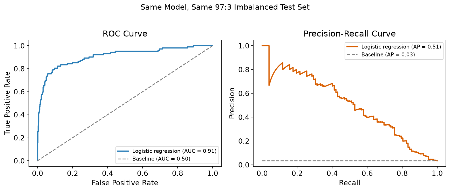
The ROC curve bows sharply toward the top left corner, well away from the diagonal. The Precision-Recall curve, on the other hand, shows precision falling from close to 1 down toward the baseline as we push recall higher, which is exactly what we would expect: to catch more of the rare positive cases, the model has to accept more false alarms.
The curves tell different things:
The ROC curve is telling us that the model ranks positive instances above negative ones very reliably across the whole population.
The Precision-Recall curve is telling us that, if we act on every instance flagged positive, roughly half of those alerts will be false alarms once we ask for reasonable recall.
When to Use a ROC Curve vs a PR Curve
Reach for a Precision-Recall curve when the positive class is what you care about, and false positives on that class carry a real cost, such as fraud detection, rare disease screening, or spam filtering.
Reach for a ROC curve when you want a threshold-independent summary of how well the model ranks positives above negatives overall, or when the classes are close to balanced, so the choice matters less.
Nothing stops you from plotting both. In practice, that is usually the right call.
Is the Precision-Recall Curve Always Better for Imbalanced Data?
A popular claim online is that Precision-Recall curves are superior to ROC curves whenever data is imbalanced. This claim is repeated so often that it is worth examining directly.
A large-scale review of scientific papers found that this claim is frequently made without a citation, or attributed to sources that do not actually argue that point. The claim has been aggressively over-generalized from a narrower, more careful original argument.
Studies comparing the two curves directly have found something more useful: if one model’s curve dominates another’s in the Precision-Recall space, it typically dominates in the ROC space too, and vice versa. The two views usually agree on which model is better, even though the numbers they report look very different.
What actually differs between them is what they emphasize. Because a ROC curve is built from all four quadrants of the confusion matrix, it gives a more holistic view of performance across both classes. A Precision-Recall curve narrows in on the positive class alone, which is exactly why it can also mislead you if the positive class is not actually what you care about.
The choice between them should be guided by what matters for your application and by the cost of different error types, not by a blanket rule that imbalance alone decides the winner.
Average Precision, Explained
We already used average precision above to summarize a Precision-Recall curve in a single number, the same way ROC-AUC summarizes a ROC curve. Let’s define it properly.
Average precision is the weighted mean of the precision values achieved at each threshold, where the weight is the increase in recall from the previous threshold to the current one:
AP = sum over k of [ P(k) x (R(k) - R(k-1)) ]
Here, P(k) is the precision at the k-th threshold, and R(k) - R(k-1) is the change in recall between consecutive thresholds. This is a discrete approximation of the area under the Precision-Recall curve, and it avoids some of the interpolation pitfalls that a naive trapezoidal estimate can run into.
In scikit-learn, you get this value directly with average_precision_score, as we already did above. There is also a modern, convenient way to plot the whole curve without manually calling precision_recall_curve:
from sklearn.metrics import PrecisionRecallDisplay

PrecisionRecallDisplay.from_estimator(
    model, X_test, y_test, name="Logistic Regression",
)
PrecisionRecallDisplay computes predictions, the curve, and the average precision score for you, and plots all of it in one call. It replaces the older plot_precision_recall_curve function, which has been removed from recent scikit-learn versions, so it is worth using it directly from the start.
Just like the curve itself, remember that a “good” average precision score is relative to the baseline, the positive class prevalence, not to some fixed number like 0.5.
Implementing a Precision-Recall Curve in Python
Let’s now build a full Precision-Recall curve workflow, step by step, for a diabetes prediction dataset with logistic regression. We use the Pima Indians Diabetes dataset, also available on Kaggle.
Step 1: Loading Necessary Libraries
First, we import the Python libraries we need. We will use numpy, pandas, scikit-learn, and matplotlib:
import matplotlib.pyplot as plt
import numpy as np
import pandas as pd

from sklearn.model_selection import train_test_split
from sklearn.preprocessing import StandardScaler
from sklearn.linear_model import LogisticRegression
from sklearn.metrics import (
    precision_recall_curve,
    auc,
    classification_report,
    confusion_matrix,
)
from sklearn.datasets import fetch_openml
Step 2: Preparing the Data
We load the dataset, then prepare it for training by creating the feature matrix X and the target vector y.
X contains the independent variables, such as age, BMI, and glucose level, that the model will use to make predictions. y contains the label we want to predict, whether a patient is diabetic (1) or not (0).
Once X and y are defined, we split the dataset into training and testing sets, using an 80-20 split. X_train and y_train are used to train the model. X_test and y_test are held back to evaluate it afterward.
Finally, we scale the features so they contribute equally to the model. Feature scaling is a prerequisite for logistic regression, and consists of transforming the data to have a mean of 0 and a standard deviation of 1.
# Load the dataset and rename the columns to their original names
df = fetch_openml(name="diabetes", version=1, as_frame=True).frame
df.columns = [
    "Pregnancies", "Glucose", "BloodPressure", "SkinThickness", "Insulin",
    "BMI", "DiabetesPedigreeFunction", "Age", "Outcome",
]
df["Outcome"] = (df["Outcome"] == "tested_positive").astype(int)

# Create feature matrix and target
X = df.drop('Outcome', axis=1)  # Features
y = df['Outcome']               # Target

# Split the dataset into training and testing sets
X_train, X_test, y_train, y_test = train_test_split(
    X, y, test_size=0.2, random_state=42,
)

# Scale the features to standardize the data
scaler = StandardScaler()

X_train_scaled = scaler.fit_transform(X_train)
X_test_scaled = scaler.transform(X_test)
Step 3: Training the Logistic Regression Model
With the data prepared and scaled, we train a logistic regression model. Logistic regression is a common algorithm for binary classification problems like this one.
The model learns to associate the input features with the target label using the training data:
model = LogisticRegression(random_state=42)

model.fit(X_train_scaled, y_train)
Step 4: Predicting Probabilities and Generating a Precision-Recall Curve
Instead of predicting classes directly, we predict the probability of a patient being diabetic. This lets us explore different thresholds and evaluate the precision-recall tradeoff at each one.
y_scores stores the predicted probabilities for the test set. From these, we compute the Precision-Recall curve, which gives us precision and recall at every threshold considered:
# Predict probabilities for the test set
y_scores = model.predict_proba(X_test_scaled)[:, 1]

# Generate precision-recall curve
precision, recall, thresholds = precision_recall_curve(y_test, y_scores)
Step 5: Finding the Best Threshold Based on F1 Score
The F1 score is the harmonic mean of precision and recall. It is a reasonable metric to optimize, since it balances both, which is useful when we want to keep both false positives and false negatives in check.
We calculate the F1 score at every threshold, and pick the one that maximizes it:
# Find the threshold that gives the best F1-score
f1_scores = 2 * (precision * recall) / (precision + recall)

best_threshold_index = np.argmax(f1_scores)
best_threshold = thresholds[best_threshold_index]
best_f1 = f1_scores[best_threshold_index]

# Print the best threshold and corresponding F1-score
print(f"Best Threshold: {best_threshold:.2f}")
print(f"Best F1-score: {best_f1:.2f}")
This is the best threshold and F1 score we find:
Best Threshold: 0.54
Best F1-score: 0.69
Step 6: Plotting the Precision-Recall Curve
Next, we plot the Precision-Recall curve, and highlight the threshold that gave us the best F1 score.
# Plot the precision-recall curve
plt.figure(figsize=(8, 6))
plt.plot(recall, precision, label='Precision-Recall curve')
plt.xlabel('Recall')
plt.ylabel('Precision')
plt.title('Precision-Recall Curve')

# Plot the threshold point with the best F1 score
plt.scatter(
    recall[best_threshold_index], precision[best_threshold_index],
    color='red', label=f'Best Threshold (F1 = {best_f1:.2f})',
)
plt.legend(loc='best')
plt.show()
Findings
At low recall values, near 0, precision is high, close to 1. The model is being selective, but accurate when it does flag a positive case.
As recall increases, precision gradually decreases. The model is catching more positives, but at the cost of more false positives too.
The best threshold, marked with the red dot, is where the model achieves the most balanced performance, giving the highest F1 score of 0.69.
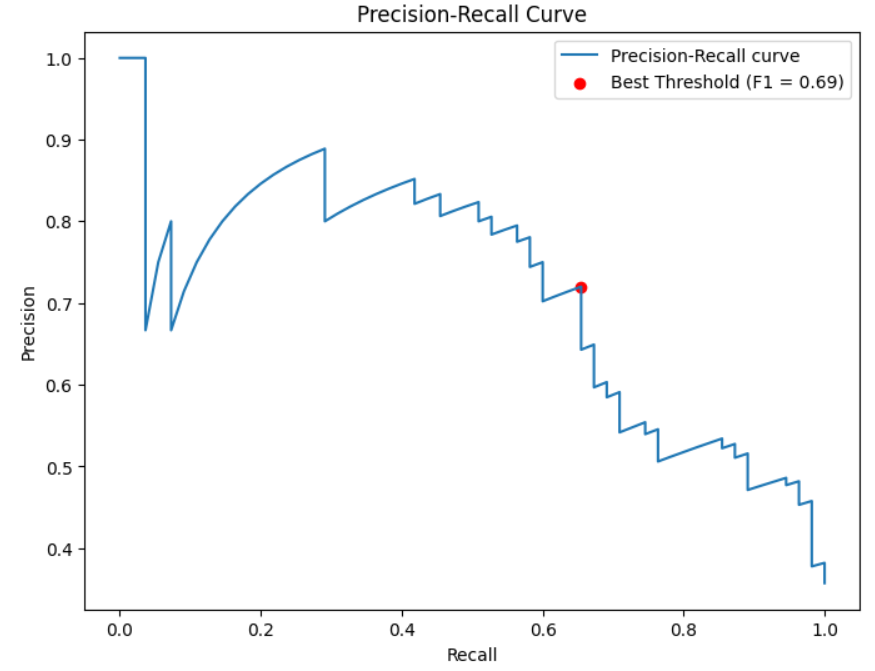
A good model has a curve that stays close to the top right corner, meaning both precision and recall stay high across most threshold settings. The larger the area under that curve, the better the model performs on this tradeoff overall.
Step 7: Evaluating the Model
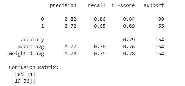
To evaluate our trained model, we use the best threshold we found to make predictions on the test set. We then evaluate those predictions with the usual metrics: precision, recall, F1 score, and accuracy.
We use classification_report to display these metrics together, and confusion_matrix to see the raw counts of true positives, true negatives, false positives, and false negatives:
# Evaluate the model using the best threshold
y_pred_best = (y_scores >= best_threshold).astype(int)

print(classification_report(y_test, y_pred_best))
print('Confusion Matrix:\n', confusion_matrix(y_test, y_pred_best))
Wrap-Up
The Precision-Recall curve is a valuable tool for assessing machine learning models, particularly on imbalanced datasets like medical diagnosis, fraud detection, or rare disease screening, where the positive class is what we actually care about.
Used alongside the ROC curve rather than instead of it, and interpreted against the right baseline, it gives us a much fuller picture of how a classifier will behave once it is making real decisions.
If you want to go deeper on evaluation metrics for imbalanced datasets, including probability calibration, check out our book Machine Learning with Imbalanced Data.
