
ROC-AUC Analysis – A Deep Dive
Evaluating a machine learning model’s performance is crucial for understanding its strengths and weaknesses. The ROC-AUC analysis—short for Receiver Operating Characteristic and Area Under the Curve—is a widely used and reliable method for assessing binary classification models. It provides valuable insight into a model’s ability to distinguish between classes, even in the presence of imbalanced datasets.
What is the ROC-AUC curve and why is it so important?
In this article, we’ll break down ROC-AUC analysis, explain its core concepts, and show how it helps evaluate machine learning models. You’ll learn how ROC curves and the Area Under the Curve (AUC) work, what they represent, and how they relate to decision thresholds. By the end, you’ll have a solid understanding of this essential evaluation tool.
To master the use of classification metrics for imbalanced datasets, check out our book Machine Learning with Imbalanced Data.
Before discussing ROC-AUC analysis, we should first introduce a common classification metric on which the ROC curve is based on: The confusion matrix, from which we derive the True Positive Rate and False Positive Rate.
Confusion Matrix
When working with classification models, particularly binary classifiers, we rely on various metrics to measure performance. The most common starting point is the Confusion Matrix, which summarizes the outcomes of the model by breaking down predictions into four categories:
- True Positive (TP) – Correctly predicted positive class outcomes.
- True Negative (TN) – Correctly predicts the negative class outcomes.
- False Positive (FP) – Predicts positive class, when in reality the instance is negative.
- False Negative (FN) – Predicts negative class, when in reality the instance is positive.
These categories are used to calculate the True Positive Rate (TPR) and the False Positive Rate (FPR).
True Positive Rate and False Positive Rate
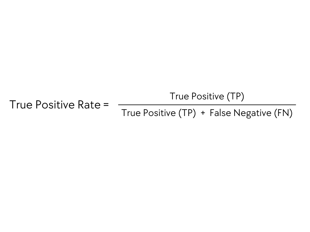
TPR, called Recall or Sensitivity, measures the model’s ability to identify positive instances. In other words, it’s ability to identify how good a model is at predicting positive instances.
We define TPR as the ratio between the actual positives predicted by the model and the total positives predicted by the model:
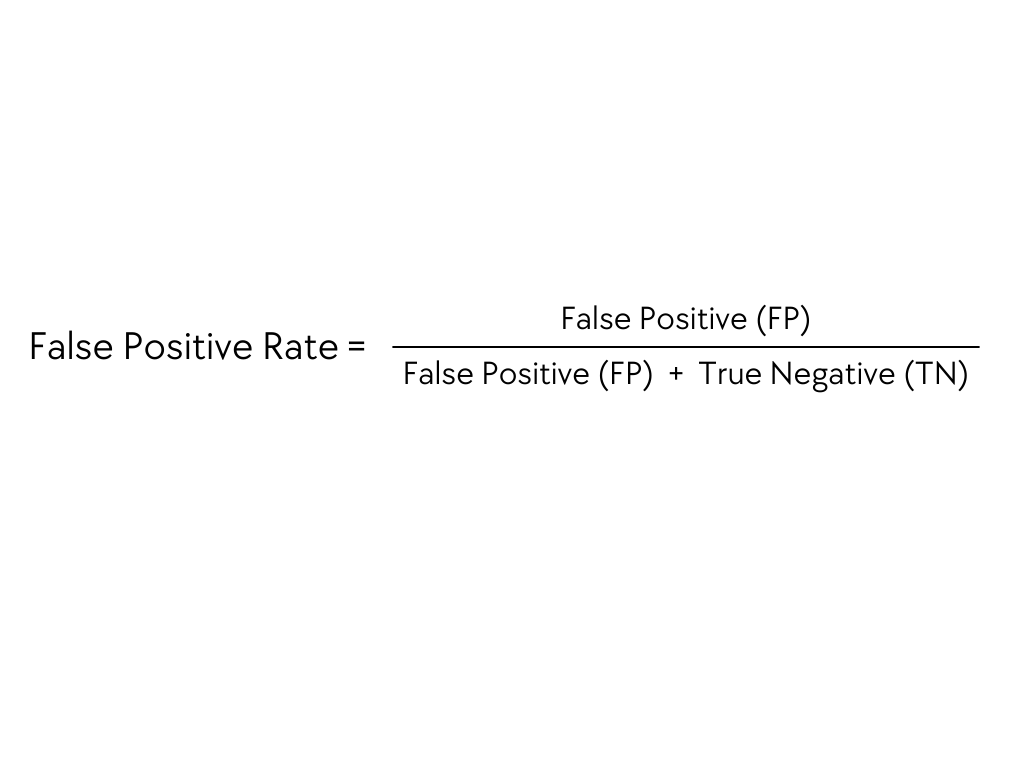
The False Positive Rate (FPR) measures how often a model incorrectly classifies a negative instance as positive. It is defined as the ratio of false positives to the total number of actual negative cases:
TPR and FPR provide insight into the trade-offs between correctly identifying positive cases and minimizing false alarms. In real-world problems, the trade-off between Sensitivity and Specificity gives a clearer vision of how the model performs.
TP, TN, FP, and FN are a lot to take in. Understand them better with clear explanations in our book Machine Learning with Imbalanced Data.
Sensitivity and Specificity
Sensitivity, also known as Recall and True Positive Rate, represents the model’s ability to identify positive instances. It answers the question: “Out of all actual positives, how many did the model correctly classify?”
Specificity, on the other hand, measures the model’s ability to correctly identify negative instances. It answers the question: “Out of all actual negatives, how many did the model correctly classify?”
The False Positive Rate (FPR) is calculated as:
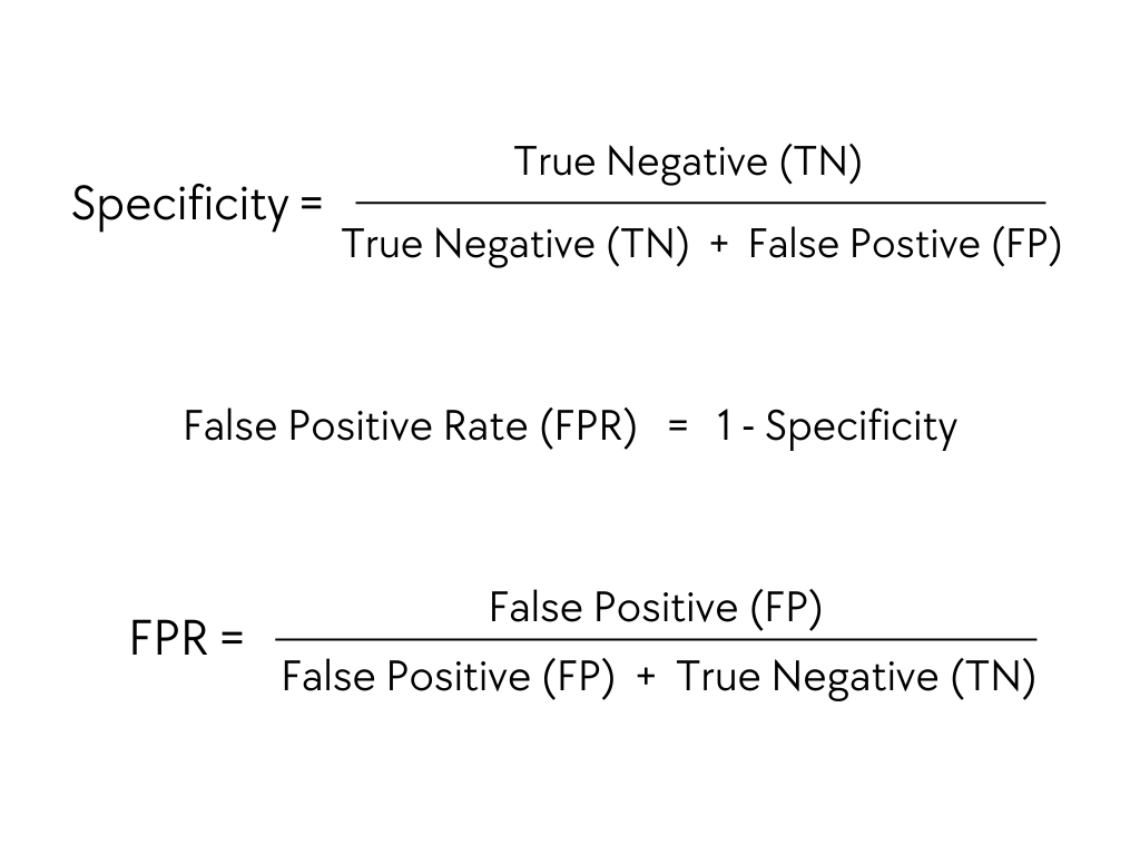
At first glance, comparing the True Positive Rate (TPR) with the True Negative Rate (TNR) might seem reasonable, as both measure how well a model distinguishes between positive and negative instances. However, when evaluating a model’s performance, it’s equally important to consider the errors—specifically, how often negative cases are misclassified as positive (False Positives). This is where the False Positive Rate (FPR) becomes essential.
FPR gives a clearer picture of the cost of these misclassifications. That’s why, in practice, model performance is often assessed by comparing TPR and FPR.
To generate the ROC curve, we calculate TPR and FPR across various classification thresholds. This allows us to evaluate the trade-off between correctly identifying positives and mistakenly flagging negatives.
TPR, FPR and the lot are a bit of a mouthful. Understand them with clear explanations in our book Machine Learning with Imbalanced Data.
Decision Threshold
In binary classification, models assign a probability score to each prediction, indicating the likelihood that a given instance belongs to the positive class. However, to make a final prediction, we need to set a decision threshold. This threshold determines whether an instance is classified as positive or negative (class 1 or class 0).
For example, in a binary classification model, to predict whether an email is spam (positive class) or not (negative class), the model outputs a probability score for each email. By setting a suitable decision threshold, we can classify emails as spam or not spam.
If the decision threshold is set at 0.6, then every email instance with a probability score equal to or greater than 0.6 will be classified as spam, otherwise as not spam.
The decision threshold acts as a cut-off point for models to classify instances as positive or negative.
Find out how wrongly setting the decision threshold led to years of misuse of resampling to tackle imbalanced data in our “7 Takes on Working with Imbalanced Data“.
Adjusting the decision threshold changes the number of positive and negative predictions, which in turn affects the TPR and FPR.
- Lowering the threshold (e.g., from 0.5 to 0.3) makes the model more lenient, increasing the number of instances classified as positive. As a result, the True Positive Rate (TPR) rises—since more actual positives are correctly identified—but so does the False Positive Rate (FPR), as more negative instances may be misclassified as positive.
- Raising the threshold (e.g., from 0.5 to 0.7) makes the model more strict, reducing the number of instances classified as positive. As a result, the False Positive Rate (FPR) decreases—since fewer negatives are misclassified—but the True Positive Rate (TPR) also drops, as more actual positives are missed.
The trade-off between True Positive Rate (TPR) and False Positive Rate (FPR) is a key factor in assessing a model’s effectiveness. For example, in medical screening, we might lower the threshold to catch as many potential cases as possible—even if it means accepting more false positives. Conversely, in fraud detection, we may prefer to raise the threshold to reduce false positives, even if that means missing some true fraud cases.
At first, this might seem counterintuitive—why would we allow actual fraud to slip through? The reality is that fraud investigators have limited capacity and can only follow up on a certain number of flagged cases. There’s a practical bottleneck.
That’s why it’s critical to choose a threshold that balances TPR and FPR based on the specific needs of the problem. The ROC curve helps us do exactly that, by visualizing how these rates shift across different threshold values.
Receiver Operating Characteristic (ROC) Curves
The Receiver Operating Characteristic curve is a tool that helps us visualize how our model’s performance changes with different classification thresholds. It plots the True Positive Rate (TPR) against the False Positive Rate (FPR) for various decision threshold values.
In the ROC curve, the X-axis represents the False Positive Rate (FPR) and the Y-axis represents the True Positive Rate (TPR).
Here’s how a typical ROC curve looks like :
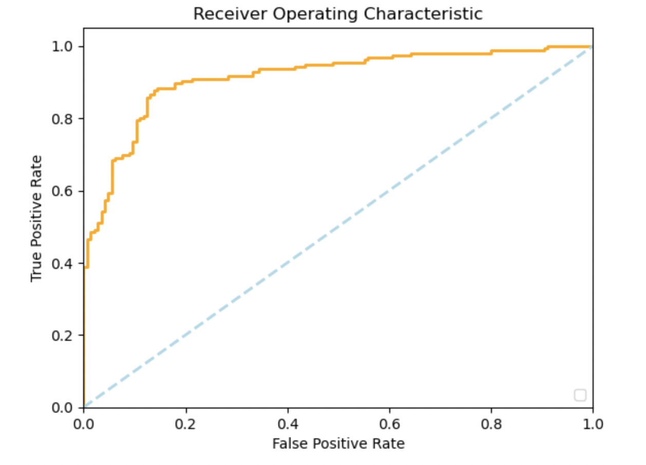
Each point on the ROC curve corresponds to a specific threshold setting, showing the trade-off between the TPR and FPR.
The ROC curve helps identify the threshold that best balances sensitivity and specificity, optimizing model performance for the problem at hand. But that’s not all, beyond just selecting a threshold, the overall shape of the curve offers deeper insights into the model’s ability to distinguish between positive and negative classes.
Interpreting the ROC curve
In a nutshell, the closer the ROC curve is to the top-left corner of the graph, the better the model is at distinguishing between positive and negative instances.
A curve closer to the top-left corner means high TPR and a low FPR for most threshold values, which indicates that the model correctly identifies the positive class, making few mistakes.
In contrast, a curve closer to the diagonal line represents a model that makes predictions no better than random chance.
The diagonal line on the ROC curve represents random guessing. A model who’s ROC curve is along this line, has an equal chance of classifying an observation as positive or negative, meaning its predictive power is no better than a coin toss.
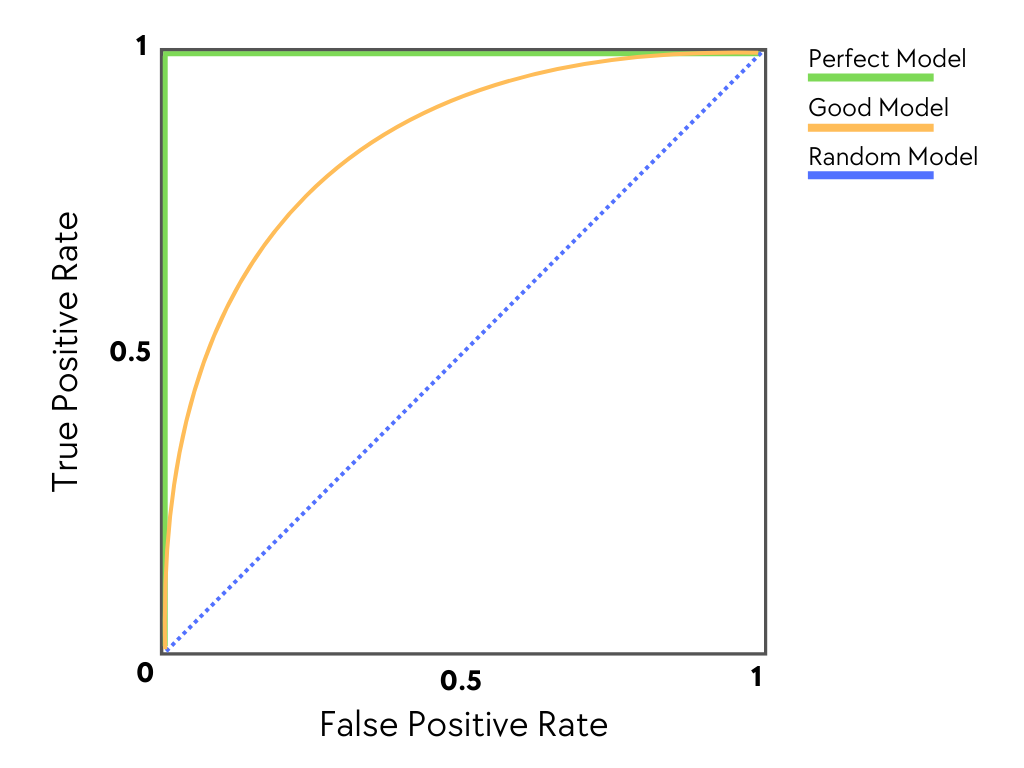
Let’s illustrate this with an example. In the following image, we show 3 models performance assessed using the ROC curve: a perfect model (green), a random model (blue) and a good model (yellow).
A perfect model (green curve) shows a TPR of 1 and an FPR of 0 for all decision thresholds. This indicates that the model accurately identifies all positive instances while making no errors in predicting negative classes as positive.
A random model (blue) shows a diagonal line from the bottom-left to the top-right, meaning it guesses true positives and false positives equally, with no real distinction between classes.
Any model above the diagonal line is considered a good model (yellow).
Plotting the ROC curve offers valuable insights into the model’s performance across various thresholds. Moreover, we can summarize its overall performance by measuring the Area Under the Curve (AUC).
Master the use of ROC curves and ROC-AUC with clear, practical explanations. Check out our book Machine Learning with Imbalanced Data.
Area Under The Curve (AUC)
The Area Under the Curve (AUC) of the Receiver Operating Characteristic (ROC) curve summarizes a model’s performance with a single number, making it easier to compare and evaluate different models.
We calculate AUC as the total area under the ROC curve, covering all possible threshold values. The higher the AUC, the better the model is at distinguishing between positive and negative instances. Essentially, AUC summarizes how well the model separates the classes.
The following image shows the AUC (green shaded area) in a ROC curve:
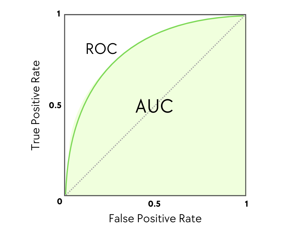
The AUC varies between 0.5 and 1. It is 0,5 when the model is as good as a random guess, or 1 when the model is perfect.
If the AUC is lower than 0.5, then the problem was not correctly set up, in that, it is not predicting the class of interest.
Interpreting AUC Values
- AUC = 1.0: A perfect model that is able to distinguish between positive and negative classes without any error. This is an ideal situation and, of course, impossible to achieve in the real world.
- AUC > 0.5: Values in this range indicate that the model performs better than random guessing. As the AUC value increases above 0.5, the model’s ability to correctly distinguish between the positive and negative classes improves.
-
AUC = 0.5: A model that performs no better than random chance. This implies that the model has no discriminatory power between positive and negative classes.
- AUC < 0.5: The model or the evaluation framework was not set up correctly. Typically, the model was set to predict one class, but we are evaluating its performance on the other class.
While the ROC curve gives a visual representation of the trade-off between sensitivity and specificity for different thresholds, AUC provides a numerical summary of the performance of the model across all threshold values. This makes AUC particularly useful:
- Threshold Independence: Metrics like Accuracy, Precision, Recall, and F1-score evaluate a model’s performance based on a specific decision threshold. This means they only reflect how the model performs under one particular threshold, providing a limited view of the model’s overall effectiveness. In contrast, the ROC-AUC summarizes performance across all thresholds, providing a more comprehensive view of the model’s ability to differentiate between classes.
- Comparing Models: AUC provides us with a single scalar value that summarizes the model’s overall performance. When comparing multiple model algorithms, AUC allows us to quickly see which model is better (the higher the AUC, the better the model), without having to manually inspect multiple ROC curves or adjust thresholds.
The AUC ROC analysis is a powerful tool for evaluating and comparing the performance of models. Its value is especially highlighted when working with imbalanced datasets, where traditional metrics may fall short of providing an accurate assessment.
Imbalanced Data & Importance of AUC ROC Analysis
In real-world classification problems, especially those involving imbalanced datasets, traditional metrics like accuracy, precision, and recall may not give a full picture of model performance. A prime example is medical diagnosis, where correctly identifying a small number of positive cases (like diagnosing a rare disease) can be of vital importance, and poor model performances can have significant consequences. In such cases, the ROC-AUC becomes a crucial evaluation tool.
Let’s understand this with an example.
Imagine you’re developing a model to diagnose a rare but serious medical condition, such as a specific type of cancer. Out of 10,000 patients, only 200 (2%) have cancer, while the remaining 9,800 are healthy. This means that the dataset is heavily imbalanced, with a vast majority belonging to the negative (healthy) class. Here’s how different metrics would evaluate the model, and why the ROC-AUC is particularly useful in such cases.
Accuracy
In imbalanced datasets, accuracy can be extremely misleading. Let’s say your model predicts every patient as “healthy” to minimize the risk of false positives. In this case, it would have an accuracy of 98%—which seems impressive at first glance—but in reality, the model is missing all the patients who actually have cancer. Accuracy, here, hides the fact that the model has failed at detecting the cases it was designed to find. Therefore, relying solely on accuracy in an imbalanced dataset can lead to false confidence in model performance.
Precision, Recall, and F1 score
Precision tells us how many of the predicted cancer cases are actually correct. In a highly imbalanced dataset, even a small number of false positives can drastically reduce the precision. For example, if the model predicts cancer in 100 patients, but only 10 actually have it, the precision would drop to 10%. This low precision makes the model seem ineffective, even if it accurately identifies most of the true cancer cases. Therefore, If we rely solely on precision, we might avoid using a model that is actually good at detecting most cancer cases because its precision is low.
Recall tells us how many of the actual cancer patients the model correctly identifies. While recall is important in medical diagnosis because missing a cancer diagnosis could be deadly, it also has its limitations. For example, a model with high recall could result in many false positives, which can cause unnecessary stress and medical tests for healthy patients. Therefore, relying on a recall alone could give a false sense of security that the model is performing well, when in reality it may just be flagging too many false positives.
F1-score attempts to balance precision and recall by calculating their harmonic mean. While this gives a more balanced view, it still requires a fixed decision threshold. In an imbalanced dataset, the F1 score could be skewed depending on how you set the threshold, making it harder to evaluate the model’s performance across all thresholds.
ROC curve and AUC
Here’s where ROC AUC proves to be especially useful. Unlike the previous metrics, the ROC-AUC evaluates the model’s performance across all thresholds and provides a single number (AUC) to summarize the model’s ability to distinguish between the positive (cancer) and negative (healthy) classes.
The ROC curve helps clinicians or data scientists make informed decisions about the best threshold to use, considering the serious consequences of both false positives and false negatives.
Beyond its ability to handle imbalanced datasets, the ROC AUC offers several additional advantages that make it a valuable tool for evaluating model performance:
- Threshold independence: the ROC-AUC evaluates model performance across all possible thresholds, providing a complete view without relying on a specific decision point.
- Performance Summary: AUC offers a single, easy-to-interpret value that summarizes a model’s overall performance.
- Interpretation of AUC values: AUC values can be easily interpreted, with higher values indicating better model discrimination between positive and negative classes.
- Model Comparison: AUC allows for the straightforward comparison of multiple models by summarizing their ROC curves with a single value.
- Diagnostic Accuracy: the ROC-AUC provides an objective measure of the accuracy of diagnostic tests, particularly in distinguishing between classes. It helps determine the optimal cut-off value for diagnosing a disease.
- Optimal Cut-off Determination: ROC curve analysis helps in determining the optimal cut-off value for a diagnostic test or classification model by identifying the point on the ROC curve that maximizes both sensitivity and specificity.
Limitations of the ROC analysis
The ROC analysis is a robust method with enormous benefits while evaluating a model’s performance. However, it is not suitable for all kinds of problems. For example, in multi-class classification, ROC AUC can become complex and less interpretable, as it is inherently designed for binary classification.
When working with multi-class, if we want to use the ROC curve, we need to approach each class as one-vs-rest and plot an ROC curve per class, which is harder to interpret and compare across models.
Implementing ROC curves and AUC in Python
Python offers a variety of libraries for implementing and visualizing ROC curves and calculating the Area Under the Curve. Libraries such as scikit-learn and matplotlib make it straightforward to evaluate and compare classification models. Let’s see that through an example:
-
Importing Libraries :
import numpy as np import matplotlib.pyplot as plt from sklearn.metrics import roc_curve, auc from sklearn.model_selection import train_test_split from sklearn.datasets import make_classification from sklearn.linear_model import LogisticRegression -
Preparing Data: Load your dataset and split it into training and testing sets. For demonstration purposes, you can use synthetic data generated by
make_classification.X, y = make_classification(n_samples=1000, n_features=20, n_classes=2, random_state=42) X_train, X_test, y_train, y_test = train_test_split(X, y, test_size=0.3, random_state=42) -
Model Training: Train your classification model using the training data. Here, we use a logistic regression.
model = LogisticRegression(random_state=42) model.fit(X_train, y_train) -
Generating Predictions: Use the trained model to predict probabilities on the test set. The ROC curve is based on the predicted probabilities rather than the predicted classes.
y_prob = model.predict_proba(X_test)[:, 1] -
Plotting ROC Curve: Compute the ROC curve and plot it using
matplotlib.fpr, tpr, _ = roc_curve(y_test, y_prob) roc_auc = auc(fpr, tpr) plt.figure() plt.plot(fpr, tpr, color='ligtgreen', lw=2, label='Logistic ROC (area = %0.2f)' % roc_auc) plt.plot([0, 1], [0, 1], color='red', lw=2, linestyle='--') plt.xlim([0.0, 1.0]) plt.ylim([0.0, 1.05]) plt.xlabel('False Positive Rate') plt.ylabel('True Positive Rate') plt.title('Receiver Operating Characteristic') plt.legend(loc="lower right") plt.show()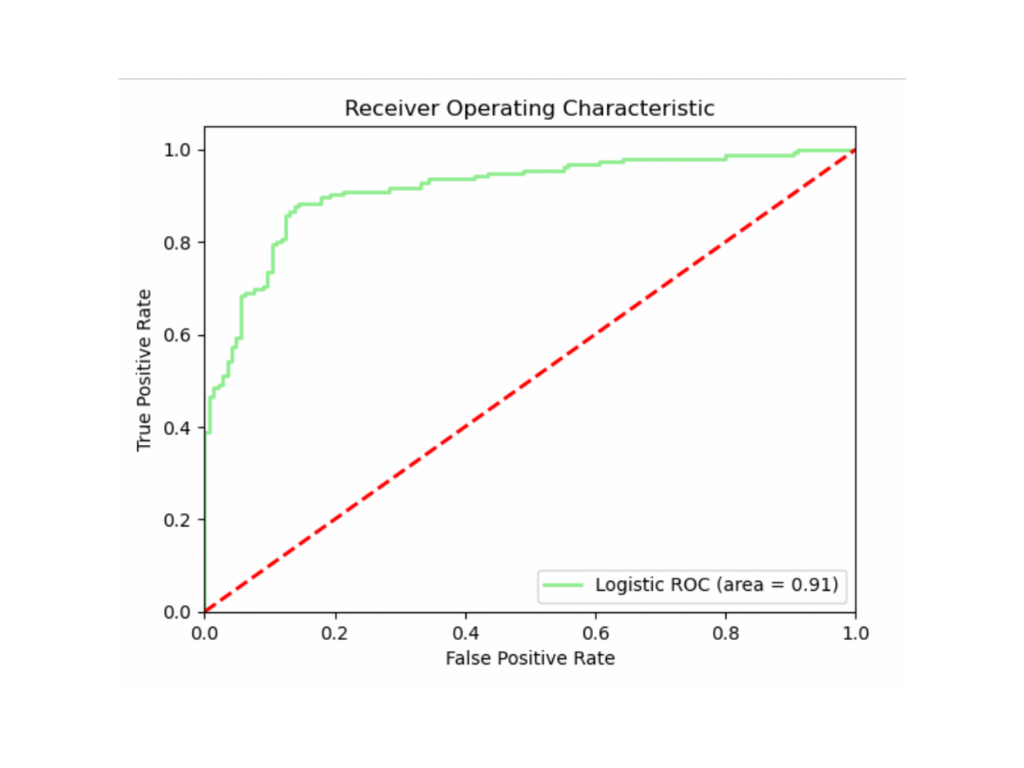 -
Calculate the AUC: The
aucfunction calculates the Area Under the Curve based on the ROC curve data. We calculated it in the former code block. Let’s print out the value:print(f'AUC: {roc_auc:.2f}')#OUTPUT AUC: 0.91 -
Alternative AUC Calculation: Instead of manually computing the AUC using the
auc(fpr, tpr)function, you can directly calculate the AUC score in a single line of code by usingroc_auc_score(y_test, y_prob). This method simplifies the process when you only need the AUC value without visualizing the ROC curve.
In conclusion, the AUC-ROC analysis is an essential tool for evaluating the performance of binary classification models, especially when dealing with imbalanced datasets. By visualizing the trade-offs between True Positive Rate (Sensitivity) and False Positive Rate across various decision thresholds, the ROC curve provides a comprehensive view of a model’s ability to differentiate between classes.
The Area Under the Curve (AUC) further simplifies this by offering a single value to compare model effectiveness. In fields like fraud detection or medical diagnosis, where correctly identifying rare events is critical, understanding and applying AUC-ROC analysis can significantly enhance the decision-making process. Ultimately, it allows for better model comparison and selection, leading to more robust and reliable outcomes in real-world applications.
Additional Resources
To learn more about Imbalanced Data, how it affects model performance, what modeling techniques are used in the industry to solve data imbalance, and much more, check out our book Machine Learning with Imbalanced Data.